
From first sight at this draft, it seems that it has been well laid out and well designed, however when it came to production of this design it did not look worthy of my front cover, and so the layout was moved to the contents page where, as you can see, it looked better. The rest of the magazine layout was kept the same, although there were some minor adjustments to the text and positioning of smaller things.
My magazine has been produced for the month of April, where the Spring traditionally starts. This gave me the base of my background, as with the new season brought vibrant colours. I decided to use the grass as my background. I used grass because of the new season, and also because green is an intresting colour to use on a front cover. With this choice of colour, I believe that my magazine would stand out from the rest of the magazines on the shelf and therefore become more likely to be chosen.
I took an image of my lawn on a bright, sunny day so as to emphasise the green colours associated with grass, and also the make the image look more spring-like and colourful :
 My next task after this image was to cut the shadows out of the image, as I feared that these may lure the attention of the reader away from the main focus of the page. To take these images out of the equation, I simply expanded the image so that it was larger than the A4 size specified, and then repositioned it so that none of the shadows were showing. This is how I came to the background image for my front cover.
Main Image
After I had decided to change the image on my front cover, it was then up to me to choose an image which was original, eye-catching and relevant to my target audience / magazine. I decided to stick with the original concept of Dom Norman being the prominent image. I set off around the school grounds and areas around the island, taking photos of Dom against various backgrounds and scenaries, ending up with a vast array of him in different places. I liked the look of a select few of these, and after deliberation, I chose this image to take forward to be edited :

Mast Head
My mast head was positioned in the top left hand corner of the page, much like they were with NME and Q. I decided upon the title 'MAN' (Music of an Alternative Nature) because it was short (much like NME and Q), was an acronym and it was easy to say. Granted, the name may lead some readers to think that it was a magazine for male homosexuals or a rival to FHM, however I believe that with the right mixture of advertising and marketing, then my magazine's name will be recognised instantly as a music magazine. I decided upon bright colours for the text colour, and by using the gradient tool within PhotoShop I was able to come up with vibrant colours which would catch the eye of any passer-by :

After the mast head was in place, I wrote the full name of the magazine underneath in white lettering, which is seen on the final version at the end of this post.
Picture
Seen as though my double page spread focuses on Dom Norman, I decided to make my front cover also about Dom, and so the image could only really be one person. This picture was taken from a high-angle, looking down on Dom. I directed Dom to look at the camera, as this would give eye contact between himself and the readers of my magazine. This was a constant recognition in my research into similar media texts. I decided to place Dom to the right hand side of the page, much as he is in my draft; only in a different pose :

The text that went with this image was fairly self-explanatory. The main heading was simply his name, with the subtext introducing who Dom is and why he is on the front cover of my magazine. For the heading's font, I used a stylish yet playful font, which fits in perfectly with Dom's persona :

Text
The text for my front cover is aligned to the left of the page, as it is in my draft. My first heading explains the bright background image, stating 'Spring is here!' and then a relevant article about Spring. The rest of the headings are also relevant to the magazine, with all headings being featured in the contents page. Because the headings as they were looked bland and out of place, I decided to use the 'Blend Options' on PhotoShop, which enabled me to spruce up the text. I added an 'Outer Glow' to each heading, which made it jump out of the page and therefore be more eye-catching :

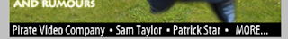
The bottom of the page looked bland and needed to be filled, and so I looked back to the similar media texts research I conducted earlier and discovered that all magazines had an insight bar running along the bottom of the magazine. This gave me the initiative to include this item, which made my front cover look more interesting and fuller of information, which my target research also stated :
Dead Space
With all of this in place, I was still not satisfied with my front cover. I felt that it needed more to add emphasis to it, and also to fill up the blank spaces which were a feature of my design. Firstly, I looked to the gaps between the text on the left of the page. Moving the text closer together would only make the cover look more cluttered and make it harder to understand where one part ends and another begins. Thinking about it, it became obvious that all was needed were thick lines running between each article heading. Again, I went onto 'Blend Options' and selected the 'Outer Glow' feature which worked so well for my text :

Now I looked to the space between Dom and the rest of the page above him. I included the date, price and issue number as stated in my draft, and found a Barcode text on the Internet which lead me to creating my own barcode. This accounted for some of the space, however there was still too much emptiness. I decided to click on the brush options given on PhotoShop and browsed through these, looking at possible patterned stamps, or simple brushed which would give me the desired effect. Eventually, I came to a splattered effect, which I enlarged and proceeded to loosely trace around Dom's image, giving this effect :

I believe that this effect brings the image out of the page, as this simple outline boldens the image and makes it stand out from the background.
During the process of my front cover, I have learnt how to use a gradient tool, I have reused the magnetic lassoo which has become a feature of this project, and I have also used the research into similar media texts to further my design and make it look more professional. Overall, I am pleased with the way that my front cover has turned out, and I think that it is better than my original draft :

No comments:
Post a Comment