• In what ways does your media product use, develop or challenge forms and conventions of real media products?
My media product uses forms and conventions of real media products in the sense that I have kept to the codes and conventions normally found within a magazine. I have used my research into similar media texts to my advantage, seeing how each magazine makes up for the dead space, how their imagery is used, how to attract their reader etc. and therefore I feel that I was able to keep to a strict criteria when making my magazine. I feel that my front cover will attract the reader becuase of the way the image stands out, and how the text has the outer glow effect which will stand out from other magazines. The colour scheme of the front cover is very summery, with bright colours everywhere. This colour contrast to other magazines on the shelf will also make the magazine stick out, whereas had I gone for a bland and dull scheme then my magazine would be left on the shelf as it would get no attention. The whole of the page has been used, which was part of the criteria in my questionnaire. I have adhered to my questionnaire earlier on in the task as I responded to the calls of the general public by using the whole space, used a male musician, a rock category and also made the colour stand out from other magazines.
My contents page was kept simple as this was something that I found when doing my initial research. I feel that I used a good balance between text and imagery, which again was something in my research. The imagery was all relevant (relating to the questionnaire) and also had the page number and a brief heading for that image. This meant that I kept to the various codes and conventions required for a contents page. Underneath the headings of the contents pages I wrote 1-3 lines on what to expect from the article which would express an interest to the reader. This meant that I needed to use the correct phrases and terminology so that I would entice the reader to turn to that particular page. The contents page was meant to be simple as it was meant to be easy to navigate around, as this page is the base of the magazine which ultimately makes the magazine easy to access or difficult.
My double page spread I used a main image which ran across the two pages. I found this to be the case in most of my research and therefore I decided to do the same. The image was a fairly simple image and therefore may not necessarily attract the reader just by the image, and so I included a quote from the article which was oversized (such as the NME dps) and written in a different font. This would draw the reader into reading the article as the quote was quite an interesting one and therefore the reader would want to know more. I included a fact file which was not in any of the research that I had conducted. I feel that this was a good addition as it would get the reader to be on a more personal term with the artist and it would also give people who may not know the artist more information. The font I used was simple and clear to read, and it was a decent size also. The text wrapping which was also used towards the bottom right of the double page spread was another thing which would attract the reader, as it seems that the text is being pushed out and this would stick out from the page.
• How does your media product represent particular social groups?
My media product is aimed at males, aged 14-30 who like rock music (as shown by my questionnaire results). Because of this, my main feature (Dom Norman, male aged 16 who plays rock music) fits particularly well with my target audience and therefore it represents particular social groups by interacting with the group and expanding their knowledge of music. The fact that my main feature fits in with the social group may encourage people from this group to buy the magazine and therefore mean that my magazine has a better effect on my target audience.
• What kind of media institution might distribute your media product and why?
I believe that my music magazine would be distributed by IPC Media, a leading consumer magazine and digital publisher. IPC Media are responsible for the distribution of magazine such as NME, Nuts and Woman & Home. I think that IPC would distribute my product because they already distribute NME, another music magazine, and I believe that my media product has the same codes and conventions as this magazine and therefore I feel that it is a perfect candidate to be distributed by IPC Media.
• Who would be the audience for your media product?
As shown by my questionnaire, my audience would be males between the age of 14 and 30. Although I have stated males, there is no reason as to why females cannot purchase my magazine. I believe that the main feature of my magazine will attract my audience well as Dom Nroman fits into this target group. There is space for more people to be in my target audience, perhaps people who like softer music as not only this age group can enjoy this sort of music. If this were to happen and I noticed and increased number in older customers, I would probably change some of the contents of the magazine to fit in with this age range by possibly adding older bands which have been around for a while instead of the newer bands.
• How did you attract/address your audience?
I attracted my audience by using a bold and differently coloured mast head. This straight away distinguished my magazine from others as the mast head was different to most and therefore would be an attraction. I also used the black outline of Dom to make him stand out more from the background, and this would therefore make him seem to jump from the page. This would, again, draw the reader's eye to the page. The green background is another change from original magazines and therefore it would stand out from the ordinary black / grey backgrounds. As with the NME front cover where there were different colours flying around the page, I tried to use different colours, with black, green, orange, yellow and white predominantly featuring on the front cover. I feel that these colour changes are attractive. Finally, the outer glow around the straplines of the front cover will also attract the reader as it makes the words look bolder and more important, therefore pushing them to the front of the page.
I addressed my audience by using the correct terminology associated with my target audience. I used simple words which cannot be confused and therefore this made my magazine easier to understand and read.
• What have you learnt about technologies from the process of constructing this product?
During this project, I have been using Adobe PhotoShop and, of course, Blogger. These were two new experiences to me as I had never used either, however I have become accustomed to both and I feel I can use both to a high standard now. With PhotoShop, I have understood the use of layers which, before this project, confused me. I have also learnt how to use the various tools which come with PhotoShop, for example the clone stamp tool and the magnetic lassoo. I used various adjustments to the fonts, and I used a variation of a brush to create the outline of Dom on the front cover. I feel that I can now use PhotoShop to a decent quality now. With Blogger, I thought it would be a simple concept where you write and it automatically saves, however throughout this project I have learnt how to add imagery and video clips, and also how to change the layout of your blog. I also included a mini questionnaire in the top right of my blog which was a new experience for me.
• Looking back at your preliminary task, what do you feel you have learnt in the progression from it to the full product?
Throughout this task I feel that I have progressed a lot since the preliminary task. I have learnt how to use the tools and features in PhotoShop better, and I feel that is evident from the work I have produced. I have learnt how to use PhotoSop to a much higher standard. I have also found out what makes a good magazine, and I often find myself thinking about how a certain advert, whether on television or in a magazine, can be progressed to be a better advert, what works well and what doesn't. Overall I feel that I have learnt how to use PhotoShop better as I now have a much better understanding of the principals of it. I have enjoyed this task and I feel that it has been a valuable experience which I will be able to replicate in later life.
Friday, 24 April 2009
Audience Feedback
I asked fellow class mates to evaluate my project, pointing out the good and bad aspects of the front cover, contents page and double page spread in turn. The results I got were fairly pleasing, as most were complimentary of my work, however there were some points which were raised and there were parts which could have been improved.
Front Cover
The general feedback from my front cover was that it was average to good, with people pointing out the black outline around Dom as the particular highlight of the page. Parts that they didn't like about the page was the writing down the side; they said it could have been a better font, colour and size. Also some of the straplines were not attractive enough to draw in readers. Another criticism, not necessarily about the front cover, was the name I chose for my magazine. People criticised the name, MAN, as being easily misinterpreted and they said that it should have been a different acronym. Overall, the feedback I got for the front cover was good, however the criticisms could easily have been avoided if I had consulted before going through with the procedure.
Contents
The feedback for my contents page was average at best, with some people praising the use of imagery, and some criticising it. I got mixed reviews for this specific page, as class mates had differences in opinion with some liking the layout and imagery, and some disliking how it was set out. From this, there is not a lot I could change about it as altering one part would lead for the other group to start disliking the page. I had to settle with about a 60-40% split, with the majority liking the page as it was, however this is too close for a contents page, as the majority of all pages should be 80%+ in favour.
Double Page Spread
This is the page where most of my praise came from. It seems that the majority of my class liked my double page spread, which was a good thing to hear for my work. It seems that they liked the layout and the article which was written. The only criticism was that the image of Dom when he was 6 was too tight a fit and therefore looked out of place, however this was only a minor flaw. I am pleased with the way people responded to my double page spread as it seemed that it was about an 80% split, which is how I think every page should be.
Overall
Overall it seemed that the majority of my class liked my project and how each individual page turned out. I am pleased with the work I put in and how each page turned out, and therefore I believe that this project has been a useful task for me as it has made me realise the potential of PhotoShop.
Outer Glow
This video clip will show you how I made the outer glow effect which surrounded my front cover straplines.
Magnetic Lassoo Tool
This short video clip will take you through how I worked round Dom's body to get a solo image on my front cover.
Gradient Tool - How To Use
This short video clip explains how to use the gradient tool which turned an ordinary font colour into a colour which would certainly attract the reader's eye.


Front Cover - The Making Of
During this blog post I am going to take you through the process of production for the front cover of my magazine.

 My next task after this image was to cut the shadows out of the image, as I feared that these may lure the attention of the reader away from the main focus of the page. To take these images out of the equation, I simply expanded the image so that it was larger than the A4 size specified, and then repositioned it so that none of the shadows were showing. This is how I came to the background image for my front cover.

Draft
Here is the original draft for my front cover :
From first sight at this draft, it seems that it has been well laid out and well designed, however when it came to production of this design it did not look worthy of my front cover, and so the layout was moved to the contents page where, as you can see, it looked better. The rest of the magazine layout was kept the same, although there were some minor adjustments to the text and positioning of smaller things.
Background
My magazine has been produced for the month of April, where the Spring traditionally starts. This gave me the base of my background, as with the new season brought vibrant colours. I decided to use the grass as my background. I used grass because of the new season, and also because green is an intresting colour to use on a front cover. With this choice of colour, I believe that my magazine would stand out from the rest of the magazines on the shelf and therefore become more likely to be chosen.
I took an image of my lawn on a bright, sunny day so as to emphasise the green colours associated with grass, and also the make the image look more spring-like and colourful :
My next task after this image was to cut the shadows out of the image, as I feared that these may lure the attention of the reader away from the main focus of the page. To take these images out of the equation, I simply expanded the image so that it was larger than the A4 size specified, and then repositioned it so that none of the shadows were showing. This is how I came to the background image for my front cover.Main Image
After I had decided to change the image on my front cover, it was then up to me to choose an image which was original, eye-catching and relevant to my target audience / magazine. I decided to stick with the original concept of Dom Norman being the prominent image. I set off around the school grounds and areas around the island, taking photos of Dom against various backgrounds and scenaries, ending up with a vast array of him in different places. I liked the look of a select few of these, and after deliberation, I chose this image to take forward to be edited :
In one of my forthcoming posts, I will take you through how I managed to cut out the image of Dom from the background, thus making him look more appealing to audience without the horrific background he is currently standing in.
Mast Head
My mast head was positioned in the top left hand corner of the page, much like they were with NME and Q. I decided upon the title 'MAN' (Music of an Alternative Nature) because it was short (much like NME and Q), was an acronym and it was easy to say. Granted, the name may lead some readers to think that it was a magazine for male homosexuals or a rival to FHM, however I believe that with the right mixture of advertising and marketing, then my magazine's name will be recognised instantly as a music magazine. I decided upon bright colours for the text colour, and by using the gradient tool within PhotoShop I was able to come up with vibrant colours which would catch the eye of any passer-by :

After the mast head was in place, I wrote the full name of the magazine underneath in white lettering, which is seen on the final version at the end of this post.
Picture
Seen as though my double page spread focuses on Dom Norman, I decided to make my front cover also about Dom, and so the image could only really be one person. This picture was taken from a high-angle, looking down on Dom. I directed Dom to look at the camera, as this would give eye contact between himself and the readers of my magazine. This was a constant recognition in my research into similar media texts. I decided to place Dom to the right hand side of the page, much as he is in my draft; only in a different pose :

The text that went with this image was fairly self-explanatory. The main heading was simply his name, with the subtext introducing who Dom is and why he is on the front cover of my magazine. For the heading's font, I used a stylish yet playful font, which fits in perfectly with Dom's persona :

Text
The text for my front cover is aligned to the left of the page, as it is in my draft. My first heading explains the bright background image, stating 'Spring is here!' and then a relevant article about Spring. The rest of the headings are also relevant to the magazine, with all headings being featured in the contents page. Because the headings as they were looked bland and out of place, I decided to use the 'Blend Options' on PhotoShop, which enabled me to spruce up the text. I added an 'Outer Glow' to each heading, which made it jump out of the page and therefore be more eye-catching :

The bottom of the page looked bland and needed to be filled, and so I looked back to the similar media texts research I conducted earlier and discovered that all magazines had an insight bar running along the bottom of the magazine. This gave me the initiative to include this item, which made my front cover look more interesting and fuller of information, which my target research also stated :
Dead Space
With all of this in place, I was still not satisfied with my front cover. I felt that it needed more to add emphasis to it, and also to fill up the blank spaces which were a feature of my design. Firstly, I looked to the gaps between the text on the left of the page. Moving the text closer together would only make the cover look more cluttered and make it harder to understand where one part ends and another begins. Thinking about it, it became obvious that all was needed were thick lines running between each article heading. Again, I went onto 'Blend Options' and selected the 'Outer Glow' feature which worked so well for my text :

Now I looked to the space between Dom and the rest of the page above him. I included the date, price and issue number as stated in my draft, and found a Barcode text on the Internet which lead me to creating my own barcode. This accounted for some of the space, however there was still too much emptiness. I decided to click on the brush options given on PhotoShop and browsed through these, looking at possible patterned stamps, or simple brushed which would give me the desired effect. Eventually, I came to a splattered effect, which I enlarged and proceeded to loosely trace around Dom's image, giving this effect :

I believe that this effect brings the image out of the page, as this simple outline boldens the image and makes it stand out from the background.
During the process of my front cover, I have learnt how to use a gradient tool, I have reused the magnetic lassoo which has become a feature of this project, and I have also used the research into similar media texts to further my design and make it look more professional. Overall, I am pleased with the way that my front cover has turned out, and I think that it is better than my original draft :

Thursday, 23 April 2009
Contents Page - The Making Of
In this blog post, I am going to take you through how I made my contents page.

From this evidence, my contents page would be quite busy and full of information. As you will see later on in this blog, my contents page changed drastically, with the inclusion of what was meant to the main image on my front cover.


Draft
Here is the original draft for my contents page :
From this evidence, my contents page would be quite busy and full of information. As you will see later on in this blog, my contents page changed drastically, with the inclusion of what was meant to the main image on my front cover.
Background
I decided that my contents page would be based on a black background with the text and images jumping out of the page. On this black background would be an image from the draft above, however when I made the front cover, it seemed that it was lacking something, and this meant that the image and general layout of the initial front cover looked more like a contents page, so I incorporated the main image from my draft front cover into the contents page, positioned it on the right wall of the page and this formed the basis for my background :
As you can see, this is the exact mirror image of the front cover draft, and I believe that this was a wise idea to make this my contents page. As with the front cover draft, I decided to write the contents of the magazine on the left hand side.
Text
With these in place, I needed to write the name of my magazine and the word 'Contents' somewhere on the page. This is where I positioned them :
As you will see, the masthead font has changed since the front cover. This is because I re-made my front cover with a different background image which required a different font to that of the contents page. I decided to keep the change of font because I believe that the font works well with the colour design and layout of the contents page.
Dead Space
After the writing was positioned, there was a lot of dead and empty space floating around my contents page. I needed to fill this with something, and from my research into similar media texts, it became clear that other contents pages use pictures from articles featured on their contents page. This gave me an idea, and so I started to take relevant pictures of articles which I came up with for the contents page. Firstly, the competition which advertised the chance to win a guitar. Of course, a guitar was needed, and so I took a photo of a guitar, used the magnetic lassoo tool to cut around it and, with a feathering effect of 10px, placed it on my contents page, with additional text to direct the reader to that page :

Even after this addition, I needed to fill up more blank spaces. There was still area around the picture of Dom leaning on the right wall of the page. This needed to change, and therefore I decided to write information, much like with the guitar, which would direct the reader to the double page spread on Dom Norman :
Another area which needed filling was in the top right hand corner of the page. I decided to fill this up with a picture referring to the festival article, and so I again used the magnetic lassoo tool of a band which I took when at a festival. I moved the image to fill the vacant corner of the contents page :

There was still open space between the picture of Dom and the text, so I needed to fill this up with another image. I noticed with the Kerrang front cover that they had previews of the posters which they were giving away free with the magazine. Because of this, I decided to put in a picture of a poster which would be given away free with my magazine :

It was slightly slanted to a) give it a better fit and b) to make it look more appealing. The white box around it again adds emphasis to the image and therefore more likely to draw the reader's eye towards it.
Overall in my contents page I have created a nice looking layout to the page and have used relevant images and text to add extra information to the page. Without the small details that have occured in the process of my contents page, I think that my contents page would have turned out badly, however I feel that it looks reasonably good and I am pleased with my effort :

Tuesday, 21 April 2009
Double Page Spread - The Making Of
With this post I am going to take you through how I made my double page spread.
Draft
I created a draft drawing of what I wanted my double page spread to turn out like. This is my initial drawing :
 Unfortunately, as you will see later on, my double page spread turned out slightly differently to my drawn draft. The layout changes, and I hadn't taken into account the size of the background image or the contents of the room which I took the picture in. Apart from this, the contents of the page and the layout are fairly similar to how I planned for them to be.
Background
Firstly, I needed to take the background of the page. During my double page spread research and analysis of similar media texts, it was apparent that the majority of magazines use one main image which spreads across the two pages. I decided to mirror this method and also use one main image which will be viewable across both pages. This was my main image :

This image then needed some modification to it. The central picture (portrait) was in the way of where I wanted to write some of my article. In hindsight, it would have been easier to take this image off the wall before I took the photo, however with the use of Photoshop I was able to hide the image using the clone stamp tool. This tool allows the user to manipulate areas of the photo by copying the colours of other areas of the image. I needed to cover the picture by using this tool, and after getting the colours from the edges surrounding the picture it looked like this:


and then this :
Because of the colour changing due to the shading of the wall, I then needed to get the gradient of the colours to flow smoothly into one another. After I had done this, my background image was complete and looked like this :

Because the border around the top of the room was slanted, this made the page and image look disorientated and so I was required to enlarge the image so that it would still fit 2 A4 pages, and then placed it so that the border and the right wall were not showing. My background image was the finished and I needed to layer the text on top :

Text
I then needed to write the text for my page. This text would form the article about Dom Norman, who featured on my front cover and contents page. From my research into similar media texts, it was apparent that most articles started off with a large first letter, and the rest of the text wrapping around this letter. I decided to also use this method as it makes the article look more sophisticated and much neater as well.
Because the two pages would be split down the middle, this would affect my text and where it went. My paragraph was next to the remaining picture on the wall, and as you can see below, it forced the paragraph to become much slimmer and longer, however it still looked neat and it is still easy to read :

This was the introduction the article. The main feature of the article was a question and answer to simple questions, answered accordingly by Dom. Because of the position of the sofa, this meant the text had to be wrapped around the chair so as not to be written over the sofa :
 This is a blessing in disguise, as the wrapping makes the article look neater and more professional. This was the text which was written on my double page spread, so all that was needed was the heading and the subtitle. After these, my double page spread would be finished. Because I had written the artice, I was able to choose from the text written what would stand out as an important quote which would entice the readers :

After I decided the main heading, I then needed to write an introduction into the article. This would be 2-3 lines as seen in the research into similar media texts, and it would tell the reader what to expect within this article :

This was all the text written and everything laid out in an appropriate position. I reviewed my page, however I noticed that there was a lot of dead space surrounding my picture. From the research I conducted earlier in this task, it was clear that the better magazines did not leave much empty space on their pages, and therefore I had to make amends to this. The main area where there was dead space was around the guitar :

I needed to think of what would be relevant that could fit in the positions to the left and to the right of the guitar neck. I thought that I would be able to squeeze in a picture of something to the right of the guitar neck, and so I managed to find, shape and fit a picture in with text underneath explaining to the reader what it is :

This is a picture of Dom when he was holding a guitar, aged 6. I thought that this was extremely relevant to the article and so I fitted it in quickly. Now I needed to think about the left of the guitar, and what would be relevant to go in. I decided to put a mini factfile in about Dom Norman, with facts that his adoring fans may be interested to know about :

I believe that this was a good addition to the page, as it gives the reader something more to have a look at, and it also fills up space to make the page look less empty.
Overall in making my double page spread, I have used the clone stamp tool to cut out a picture, I have used text wrapping, written an article on a musician and realised that dead space needed to be covered up with relevant items. With this being the first double page spread I have produced, I feel that it has been a valuable experience and has not been too tedious. I believe that my first venture into a double page spread has been a success :

Wednesday, 15 April 2009
Questionnaire
I compiled a questionnaire which, I hoped, would give me some more ideas on what to include in my magazine. Questions asked included music preference and other opinionated views. Here is a copy of the questionnaire :


 Brand or context? (16 Brand, 11 Context, 23 both): I would have expected more people to focus on the brand than on the context, as I believe that people care more about what other people are buying. It was no surprise to me that more people chose brand than context, however the smaller margin was something that did surprise me. With the majority of people choosing both, I feel that this was possibly the better response.

Music questionnaire
Thank you for taking part in my questionnaire. In this questionnaire I am hoping to find the key criteria when producing a music magazine and any answers I receive will be taken into account. Please circle your choices, and where there are dots after an option please specify.
1. What gender are you? Male Female
2. What age range are do you fit? 0-9 10-19 20-29 30-39 40-49 50+
3. What music do you prefer? Rock Pop Jazz Classical Other............
4. Are you more interested in male or female musicians? Male Female
5. What 3 things do you look for in a magazine?
a. ......................................................................
b. ......................................................................
c. ......................................................................
6. Do you believe that colour is important in a magazine? Yes No
7. Do you think that it is important for the information to be relevant? Yes No
8. Does the brand of magazine influence you, or is it the context? Brand Context Both
9. Do you prefer it to be plain and simple or full of information? Plain Full
10. Any other comments:
Thank you for taking part in my questionnaire.
I gave this questionnaire out to 50 random people and these were the responses :

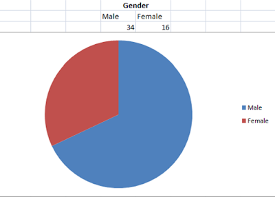
Gender (34 male, 16 female) : This shows that I attempted to include people regardless of gender, however I felt that my magazine was going to be mainly for the male population. This does not mean that females cannot purchase this magazine, as there will be some things that will be appropriate for women.

Age range : This shows that my target audience is kept to (teenagers to 30 year olds, red and green) however I have also included view-points from other members of the public to see whether this has an influence on how I think about making my project.

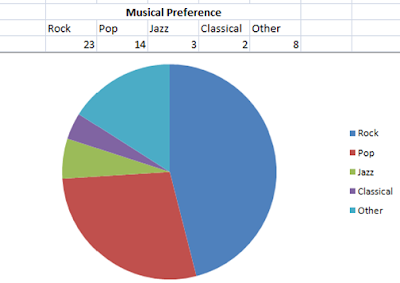
Musical Preference : This is what I thought the response would be to this question. I believe that in this modern day more people are listening to rock music than pop and this backs up my theory. The other category included metal, dance and R’n’B.

Musician gender (38 male, 12 female): This was an interesting question as I had no idea what the outcome would be. As you can see, more people choose male musicians, maybe because people are attracted to their personality, or maybe because they write better music.
Three things people look for : The three things that people look for were, in no particular order, a famous musician they like, freebies and controversial topics. I agree with this response as these are the things that I would look for, and so I will attempt to make my magazine have all of these things.

Is colour important? (45 yes, 5 no): I thought that this would be the case; however I did not expect it to be such a landslide margin. I believe that colour is important when making a magazine because it is what primarily attracts the reader into buying the magazine, and so this question was to see whether other members of the public agreed.

Is relevance important? (50 yes, 0 no): Of course it is. An article must be relevant otherwise the reader will skip ahead onto another article, which is not what an article is there for. I think that this question was to see whether it was as important as I thought it was, and it quite clearly is.
 Brand or context? (16 Brand, 11 Context, 23 both): I would have expected more people to focus on the brand than on the context, as I believe that people care more about what other people are buying. It was no surprise to me that more people chose brand than context, however the smaller margin was something that did surprise me. With the majority of people choosing both, I feel that this was possibly the better response.
Plain or full? (21 Plain, 29 full): It would appear that the majority of people prefer their article to be full of information and text. This does not necessarily mean cluttered. I think that people will want to get their money’s worth out of their magazine and therefore the more information the better.
There were no relevant responses for 10. Any other comments.
From this questionnaire I have been able to deduce things that I may not have realised earlier. I now know that my target audience feel roughly the same as me, in the sense that rock is on the increase (I categorise alternative into this section). They also agree that male musicians are better, that both colour and relevance are required and that it is better for a magazine to be full of information. Unfortunately they also decided that it was better to have a branded magazine rather than a magazine with context and so this will work against me as my magazine will be new. Hopefully with the right mixture of marketing and distribution I will be able to get my new magazine up to a recognisable brand of magazine.
Target Audience
I am going to create a music magazine that is going to be distributed to the world. Seen as though this is a new idea, I will need to create a target audience, based on who I think would buy this magazine and why. Once I have found my audience, I will then need to make my magazine worthy of being distributed to this market.
Age Range
This magazine will have a set age range which will be advertised to. The articles and bands covered will need to be thought about so they fit in with the desired target age.
The age range for my music magazine, I have decided, is going to be 14-30. I have chosen this range because I believe that between this age range are the people who still go to music festivals and are still heavily involved in music. Because of this I will need to include modern day language and nothing too over-complicated otherwise I may lose the interest of the readers. I believe that my target audience will be looking for information on bands, however I also feel that they would require light-hearted things and therefore I would need to include a few comic questions or light-hearted pages.
Gender
Gender is an important thing to think about when deciding a target audience. Males and females respond to different things and therefore they may react differently to photos used or to the wording in articles. I feel that I would be able to create a magazine for both males and females, and this is by including articles that would appeal to both. There would be bands or artists that would be listened to by both genders and therefore this is how I would overcome this possible problem.
Musical Influence
In this modern day, there are new genres of music being created. I will need to think of the vast assortment of different genres and hopefully stick to one or two of them and make the focus of my magazine mainly on these specified genres. I have decided that my main article (double page spread) is going to be about a young soloist who plays guitar. I feel that there is plenty of room for this particular genre as I feel that there are plenty of successful soloists out there at the moment. I believe that both male and female people can listen to and enjoy this type of music and therefore this genre will broaden my target audience. I also think that with the sharp rise of alternative music being produced and listened to, then I should also be focusing on the alternative genre.
Having thought about different aspects required in a magazine, I have come out with a basic target audience; this being:
- Age : 14-30 year olds
- Gender : Both male and female
- Genre : Focus mainly on indie soloists and alternative music
Subscribe to:
Comments (Atom)